Looker Studio update: enhanced chart customization with titles and styling options
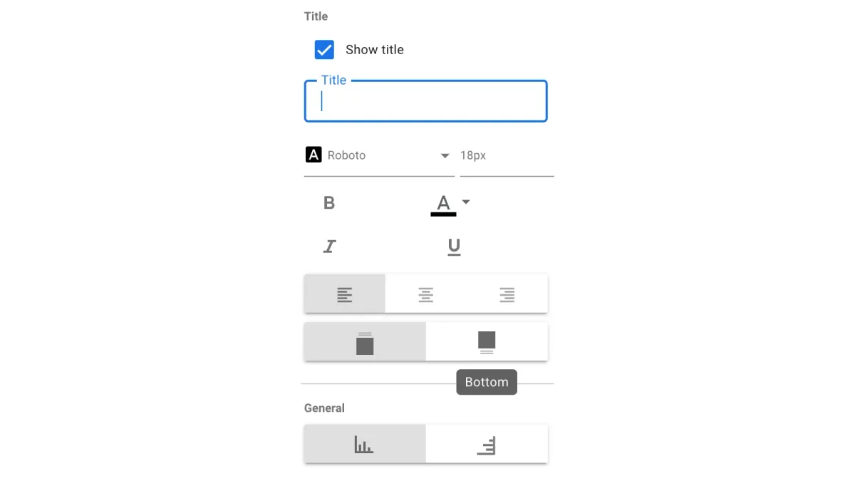
Looker Studio (formerly known as Google Data Studio) this month introduced an update that empowers users with more control over chart presentation. Previously, Looker Studio lacked a dedicated feature for chart titles. This update introduces a new "Title" section within the "Style" tab of the properties panel. Users can now directly add a title to their charts and customize its appearance, including font, color, size, and positioning.
A clear and concise title acts as a visual anchor for the chart, providing context and guiding viewers towards the key takeaway of the data. For instance, a chart depicting website traffic trends over time might benefit from a title like "Monthly Website Visits by Source."
Tailoring chart aesthetics
The "Style" tab offers various options for controlling the overall presentation of the chart. Here's a breakdown of the key functionalities:
- Show Title: This checkbox allows users to display or hide the chart title.
- Title Options: This section provides granular control over the title's appearance. Users can set the font type, size, and styling (bold, italic, underline) to enhance readability and achieve visual consistency with the overall report theme.
- Title Font Color: This option allows users to choose a color for the title text, ensuring it stands out from the chart background and other visual elements.
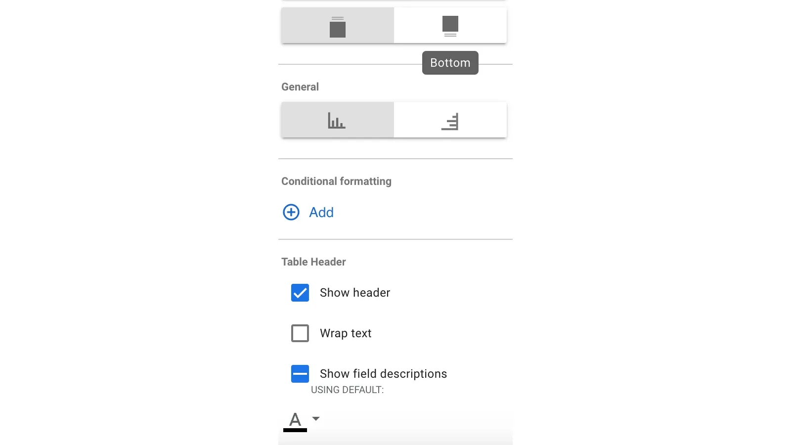
- Title Alignment and Positioning: Users can position the title at the top, bottom, left, right, or center of the chart, depending on the desired visual hierarchy.
Area chart customization
The update also introduces specific styling options for area charts, a popular choice for visualizing trends over time.
- Show Stack: This option allows users to stack data series on top of each other, making it easier to compare the relative contribution of each series to the overall total.
- 100% Stacking: When enabled, stacked charts depict the contribution of each data series as a percentage of the total value (100%). This approach is useful for highlighting the proportional composition of a whole.
- Show Cumulative: This option allows users to display a cumulative representation of the data series. Cumulative charts showcase the running total of a metric over time, providing insights into trends and growth patterns.
Additional styling options
Looker Studio provides further customization options to enhance the visual clarity and impact of charts:
- Show Points: This option controls whether to display individual data points within the chart. Hovering over a data point reveals its specific value, offering viewers a closer look at the underlying data.
- Show Data Labels: This option allows users to display the actual numeric values for each data point directly on the chart.
- Compact Numbers: When showing data labels, users can opt to display numbers in a compact format with unit indicators (e.g., 553,939 becomes 553.9K) for improved readability within limited space.
- Decimal Precision: This option allows users to control the number of decimal places displayed for metric values within data labels, ensuring clarity and focus on the most relevant level of detail.
Color coding for data differentiation
The "Color by" section within the "Style" tab offers functionalities for customizing how data is colored on the chart. This can significantly improve visual communication by allowing viewers to easily distinguish between different data series or categories.
The update offers several color coding options depending on the data structure of the chart:
- Single Color: This option applies a single color gradient to all data series, potentially useful for emphasizing trends or patterns within a single variable.
- Series Order: This option assigns colors based on the order of data series within the chart, highlighting the ranking or hierarchy of the data.
- Dimension Values: This option leverages the existing dimension value color map to color each data point according to its specific category. This approach ensures consistency in data representation across different charts within the report.
The latest Looker Studio update empowers marketers with greater control over chart aesthetics. By incorporating clear titles and leveraging the enhanced styling options, marketers can create impactful data visualizations that effectively communicate insights and engage audiences with data-driven storytelling.
. Written by Luís Daniel Rijo. Follow PPC Land on LinkedIn.
Read more

OpenAI and Reddit forge partnership for data licensing and AI-powered features
OpenAI yesterday announced a multifaceted partnership with Reddit, the popular social news aggregation and discussion website. This collaboration focuses on data licensing, AI-powered features for Reddit, and advertising opportunities for OpenAI.
Google Analytics 360 enhances report sharing with user-specific collections
Google this month announced an update for Google Analytics 360 users: the ability to assign report collections to specific user groups or individuals. This functionality empowers administrators to curate customized report experiences for different teams within an organization.

Germany: Federal Network Agency takes charge of platform supervision and enforces fair treatment for businesses
There are new regulations and a newly established enforcement body, the Digital Services Coordinator (DSC) housed within the Federal Network Agency.

DeepMind unveils SynthID: watermarking AI-Generated content
Google DeepMind, a leading artificial intelligence (AI) research lab, this week announced the launch of SynthID, a novel suite of tools designed to watermark and identify AI-generated content.
Netflix unveils Content Powerhouse and new Ad Tech Options
While reaffirming its commitment to high-quality entertainment, Netflix announced a slew of new shows and movies alongside significant developments in its ad offerings.
Netflix opens its ad inventory to The Trade Desk, Google DV360 & Magnite
According to Netflix, this summer will see the platform join the programmatic advertising space. The Trade Desk, Google's Display & Video 360, and Magnite will join Microsoft as their main programmatic partners.

Google Search gets summarized
This update, centered on AI-powered summaries, presents both challenges and opportunities for marketers navigating the evolving search landscape.
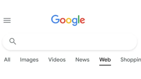
Google Search introduces Web Filter for Text-Only results
Google today announced the rollout of a new search filter called "Web" designed to display only text-based links in search results. This addition mirrors existing filters for narrowing down results to images, videos, or news articles.

Google unveils new Gemini features at I/O 2024
Google today unveiled a suite of new features and functionalities for its large language model (LLM) Gemini at its annual developer conference, Google I/O 2024.

Get creative with Remixes and Auto-Captions: new features on YouTube
YouTube today introduced some exciting new features on YouTube Shorts that will take your viewing and content creation experience to the next level. Here's a breakdown of what's new.

Advertiser sues Reddit over alleged Click Fraud
A Virginia-based investment research firm, LevelFields, filed a lawsuit against social platform Reddit, alleging click fraud and a lack of transparency in ad measurement. This was yesterday reported by The Register.
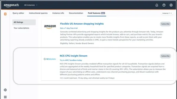
Amazon Marketing Cloud (AMC) now offers deeper insights with offline sales data
Amazon Ads this month announced an upgrade to Amazon Marketing Cloud (AMC) with the introduction of NCS CPG Insights Stream.