YouTube's major redesign
Global video platform announces new brand colors to address technical issues and refresh visual identity.

Global video platform announces new brand colors to address technical issues and refresh visual identity.
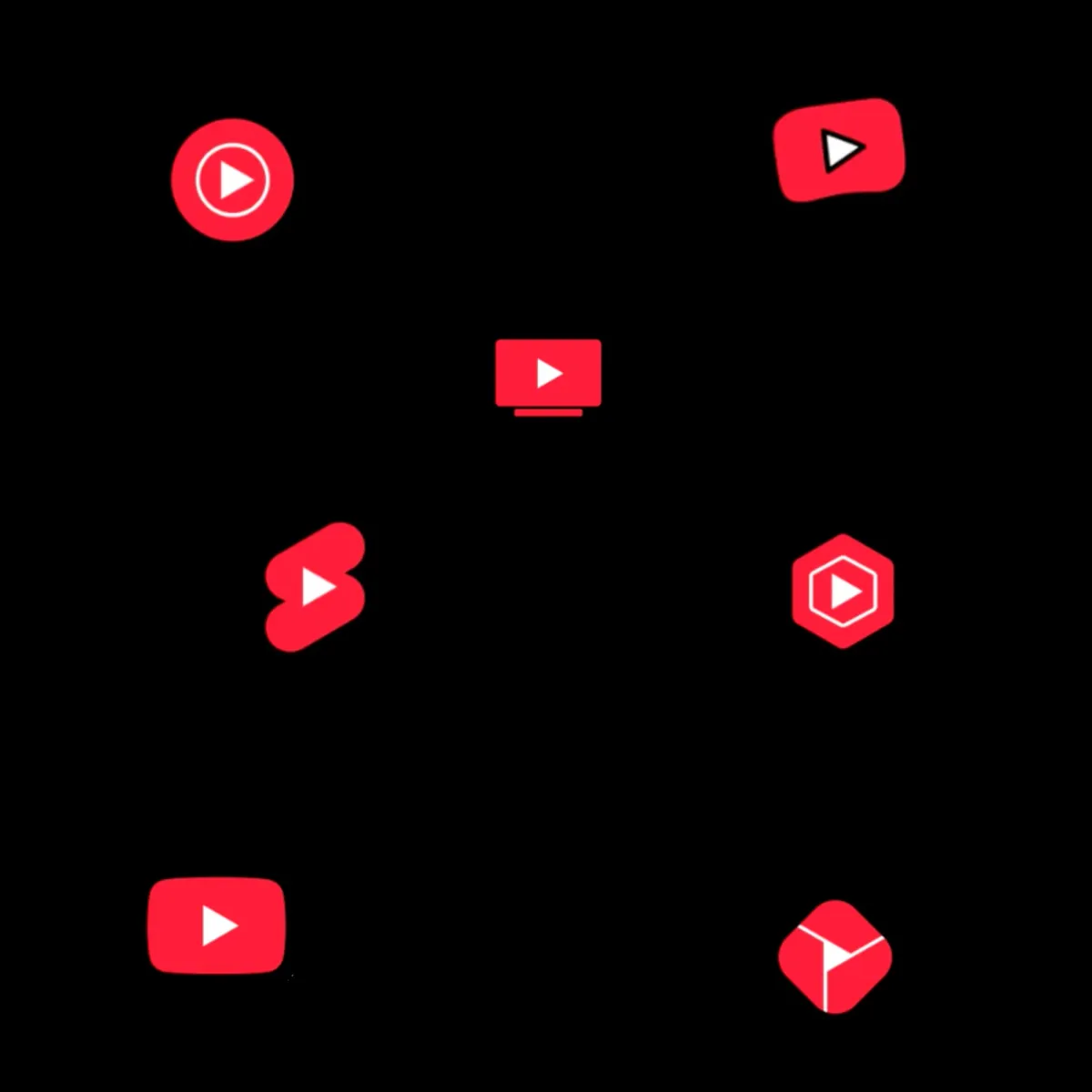
After nearly six years of using pure red in its visual identity, YouTube introduced a significant design update for its global platform, changing its iconic red color to a cooler shade and implementing a new red-to-magenta gradient. The announcement, made on February 12, 2025, marks a strategic shift in the platform's visual language while addressing several technical challenges.
According to Robyn Lee, visual design lead at YouTube, the previous red color, implemented in 2017, presented multiple technical complications across different devices. The pure red in the RGB system caused burn-in issues on television screens, where prolonged exposure resulted in permanent screen discoloration. Additionally, the color rendered inconsistently, appearing orange on certain displays and being perceived as overly aggressive in key user interface elements.
The technical team resolved these issues by developing a slightly cooler shade of red. According to Amy Yip, visual design lead, the selection process involved careful consideration of the color's cultural implications across different societies. The team evaluated potential options against YouTube's core mission of "Give everyone a voice and show them the world," ensuring the new shade aligned with their creative principles of being welcoming, engaging, dynamic, and unified.
A notable addition to the platform's visual identity is the introduction of a red-to-magenta gradient. According to Jessie Zo, senior visual designer, the team explored various color combinations, including orange and yellow, before selecting magenta as the optimal pairing with the new red. The gradient's implementation at a 45-degree angle, with magenta positioned on the right, symbolizes forward movement and progression.
The design team has implemented a strategic framework for color usage across the platform. The new red appears selectively in brand marks, identity elements, and signature user interface moments, maintaining its impact through controlled application. The gradient features in multiple interface elements, including topic icons, the video progress bar, Like and Subscribe buttons, Premium badge, and Live ring.
Motion design plays a crucial role in the updated visual system. David Amichai, senior motion designer, revealed modifications to the startup animation, which now incorporates the gradient while being 0.2 seconds shorter in duration. The progress bar received updates for a more contemporary feel, featuring a thinner profile and quicker animations.
Accessibility considerations heavily influenced the design decisions. The team developed light, medium, and dark variations of both the red and magenta hues to ensure sufficient contrast ratios across different applications. For smaller components like the Premium badge and Live avatar ring, slightly darker shades maintain a minimum contrast ratio of 4.5:1.
The platform implements an adaptive framework for motion assets, adjusting the experience based on device capabilities. According to Linda Hong, product manager, this approach ensures optimal performance across various devices, with certain animations restricted to higher-end devices to maintain system stability.
2005: Platform launch
2017: Implementation of pure RGB red
2025: Introduction of cooler red shade and magenta gradient