Looker Studio adds background colors for bar and column chart labels
Background color options for data labels enhance chart readability in latest visualization platform update.

Background color options for data labels enhance chart readability in latest visualization platform update.
Google added background color functionality for data labels in bar and column charts within Looker Studio on August 14, 2025. According to the company's release notes, users can now set data-label background colors for any bar-label-position option across both chart types.
The enhancement enables report creators to improve data visibility by applying colored backgrounds to label text. Previously, data labels appeared directly on charts without background color options, which could compromise readability when labels overlapped with chart elements or background graphics.
Subscribe the PPC Land newsletter ✉️ for similar stories like this one. Receive the news every day in your inbox. Free of ads. 10 USD per year.
The update extends existing label customization capabilities in Looker Studio's chart configuration system. Data labels in bar and column charts now support multiple visual formatting options including background colors, font styling, and positioning controls. These options appear within the Properties panel's Style tab under the Data label section.
Technical implementation allows users to select background colors from standard color palettes or apply custom color values. The background color option activates independently of other label styling features, providing flexibility in chart design without requiring comprehensive formatting changes.
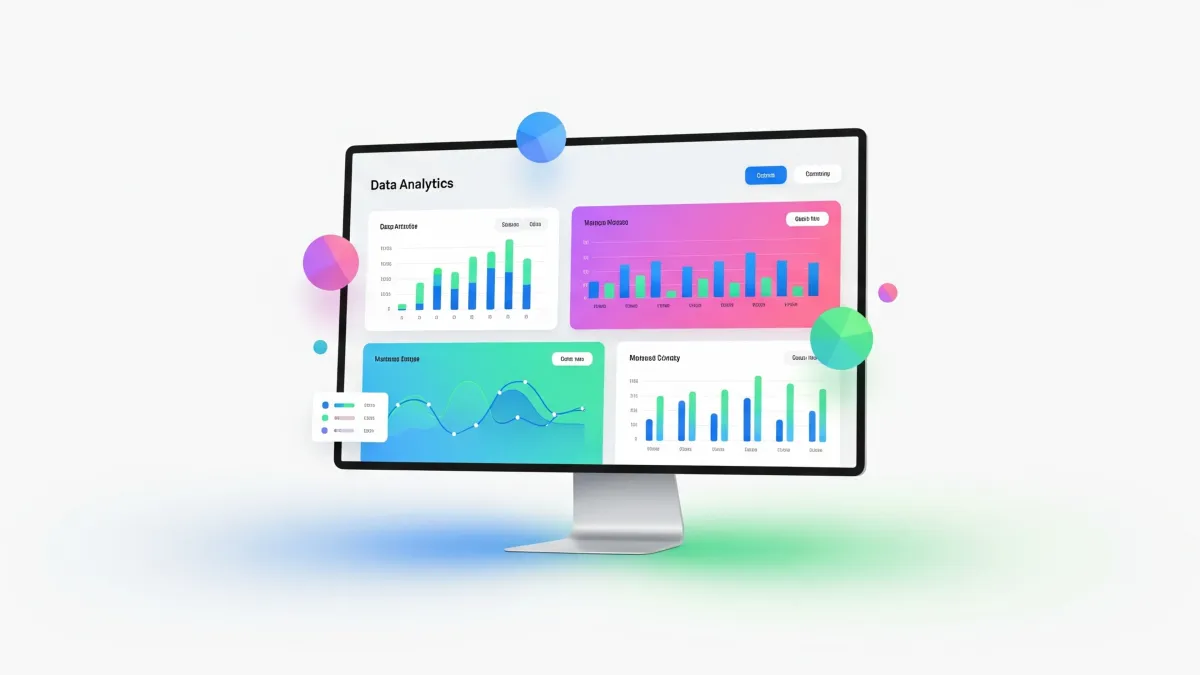
Bar and column charts represent fundamental visualization types within business intelligence platforms. They display categorical data through horizontal or vertical bars, with bar lengths corresponding to data values. Effective label presentation ensures viewers can accurately interpret chart data regardless of visual complexity.
Chart readability challenges frequently emerge when data labels overlap with chart backgrounds or when label text lacks sufficient contrast. Background colors address these visibility issues by creating distinct visual boundaries around label text. This becomes particularly important in charts with dense data presentation or complex color schemes.
The Looker Studio documentation explains that background colors can be customized through the color picker interface. Users access these settings by enabling the Show data labels option and navigating to the background color controls within the data label configuration panel.
Positioning options work in conjunction with background colors to optimize label placement. Data labels can appear inside bars, outside bars, or in custom positions depending on chart requirements. Background colors maintain effectiveness across all positioning configurations.
The feature addresses specific use cases in marketing analytics where chart clarity impacts decision-making processes. Marketing teams frequently create reports for stakeholders who need to quickly interpret campaign performance data. Clear data labels with appropriate background contrast support faster data comprehension during presentations and strategic discussions.
Enterprise reporting environments benefit from enhanced label customization through improved brand consistency and professional presentation standards. Organizations can now align chart aesthetics with corporate design guidelines while maintaining data accessibility requirements.
The update complements Looker Studio's broader modernization efforts. Recent platform enhancements include conditional formatting for query result chips, expanded partner connector integrations, and improved data manipulation capabilities. These developments collectively strengthen Looker Studio's position within the business intelligence software market.
Background color functionality integrates with existing chart styling options without disrupting current report configurations. Users with established charts can add background colors incrementally without requiring complete chart reconstruction or data source modifications.
The enhancement supports accessibility considerations by enabling better visual contrast between label text and chart backgrounds. This becomes particularly relevant for organizations meeting compliance requirements related to visual accessibility standards in digital communications.
Implementation across different chart scenarios demonstrates the feature's versatility. Stacked bar charts benefit from background colors that distinguish label categories, while simple bar charts use background colors primarily for readability enhancement. Column charts utilize similar principles with vertical orientation considerations.
Color selection options include theme-based colors that automatically align with report styling and custom colors that provide precise control over visual presentation. This dual approach accommodates both rapid chart creation and detailed design customization workflows.
The background color feature reflects Google's ongoing investment in Looker Studio's visualization capabilities. Previous updates have introduced modern charts functionality, enhanced data label customization options, and expanded chart type availability. These iterative improvements demonstrate Google's commitment to maintaining competitive functionality within the data visualization market.
Performance considerations remain minimal for the background color feature. The styling options process locally within the browser environment without requiring additional server-side data processing or extended loading times.
Marketing professionals working with campaign performance reports can leverage background colors to highlight key metrics or create visual hierarchies within chart presentations. This capability supports more effective stakeholder communication during strategy sessions and performance reviews.
Data visualization best practices recommend using background colors judiciously to avoid overwhelming chart viewers with excessive visual elements. The feature provides the flexibility to apply backgrounds selectively to specific labels rather than requiring universal application across all chart elements.
Training requirements for existing Looker Studio users remain minimal given the feature's integration within established chart configuration workflows. Users familiar with current data label options can access background color settings through the same Properties panel interface used for other styling modifications.
Subscribe the PPC Land newsletter ✉️ for similar stories like this one. Receive the news every day in your inbox. Free of ads. 10 USD per year.
Subscribe the PPC Land newsletter ✉️ for similar stories like this one. Receive the news every day in your inbox. Free of ads. 10 USD per year.
Data Labels: Text elements that display specific values directly on chart visualizations, providing viewers with precise numerical information without requiring hover interactions or separate data tables. In Looker Studio's implementation, data labels can show metric values, percentages, or custom formatted text depending on chart configuration requirements. The positioning and styling of these labels significantly impacts chart readability and user comprehension.
Background Colors: Visual formatting options that place colored areas behind text or graphical elements to improve contrast and readability. In the context of Looker Studio's bar and column charts, background colors create distinct visual boundaries around data labels, preventing text from blending with chart backgrounds or overlapping visual elements. This feature addresses common accessibility and design challenges in data visualization.
Bar Charts: Horizontal visualization format that represents categorical data through rectangular bars extending from a baseline, with bar length corresponding to data values. Bar charts excel at comparing different categories and work particularly well when category labels are lengthy or when horizontal space constraints exist. Looker Studio's bar chart implementation supports various styling options including stacked, grouped, and 100% stacked configurations.
Column Charts: Vertical visualization format similar to bar charts but oriented with columns extending upward from a horizontal baseline. Column charts are optimal for displaying time-series data or when vertical space is limited, allowing for clear category comparisons while accommodating multiple data series. The vertical orientation makes column charts particularly effective for trend analysis and sequential data presentation.
Chart Readability: The ease with which viewers can interpret and understand information presented in data visualizations. Factors affecting readability include color contrast, font sizing, label positioning, and visual hierarchy. Poor readability can lead to misinterpretation of data insights, making it a critical consideration in business intelligence reporting. Looker Studio's background color feature specifically addresses readability challenges related to label visibility.
Properties Panel: The configuration interface within Looker Studio where users access chart styling and data options. Located in the chart editor, the Properties panel contains Setup and Style tabs that control everything from data source connections to visual formatting. This centralized control system allows users to modify chart appearance, behavior, and data presentation without requiring code or complex configuration files.
Visualization Platform: Comprehensive software systems that enable users to create, customize, and share data visualizations and reports. Looker Studio functions as a cloud-based visualization platform, providing connectivity to multiple data sources, chart creation tools, and collaboration features. These platforms serve as the foundation for business intelligence workflows, enabling organizations to transform raw data into actionable insights.
Marketing Analytics: The practice of measuring, managing, and analyzing marketing performance to maximize effectiveness and optimize return on investment. Marketing teams rely heavily on data visualization tools like Looker Studio to track campaign performance, audience engagement, and conversion metrics. Clear chart presentation becomes crucial for communicating results to stakeholders and supporting strategic decision-making processes.
Business Intelligence: Technology-driven processes for analyzing business information and transforming it into actionable insights that inform strategic decisions. Looker Studio serves as a business intelligence tool by connecting to various data sources and providing visualization capabilities that help organizations understand performance trends, identify opportunities, and monitor key performance indicators across different business functions.
Report Configuration: The process of setting up data visualizations, including selecting data sources, choosing chart types, configuring filters, and applying styling options. In Looker Studio, report configuration encompasses both technical aspects like data connections and visual aspects like chart formatting. Proper configuration ensures that reports accurately represent underlying data while meeting aesthetic and functional requirements for their intended audience.
Subscribe the PPC Land newsletter ✉️ for similar stories like this one. Receive the news every day in your inbox. Free of ads. 10 USD per year.
Who: Google Cloud engineering teams responsible for Looker Studio development and business intelligence professionals using the platform for data visualization and reporting tasks.
What: Implementation of background color functionality for data labels in bar and column charts, enabling users to set colored backgrounds behind label text for improved readability and visual presentation.
When: August 14, 2025, as documented in the official Looker Studio release notes published by Google Cloud.
Where: Available globally through the Looker Studio platform via web browsers, accessible through the Properties panel's Style tab under Data label configuration settings.
Why: Enhanced chart readability addresses visibility challenges when data labels overlap with chart backgrounds or lack sufficient contrast, supporting better data interpretation and professional presentation standards in business intelligence reporting workflows.