
One of the largest retailers in the world announced today a comprehensive brand refresh after 73 years of operations. Walmart Inc. (NYSE: WMT) unveiled a new brand identity that aims to reflect its focus on digital capabilities while maintaining its heritage.
According to William White, senior vice president and Chief Marketing Officer at Walmart U.S., the updated brand identity demonstrates the company's evolving capabilities. "This update, rooted in the legacy of our founder, Sam Walton, demonstrates our longstanding commitment to serve our customers of today and tomorrow," White stated in the announcement.
The brand refresh introduces significant changes to Walmart's visual elements. The new wordmark draws inspiration from Sam Walton's classic trucker hat, featuring a modern, custom font called Everyday Sans. This proprietary typeface includes five standard weights ranging from Light to Black, designed specifically for the retailer's communications across different platforms.
The company maintains its recognizable color scheme, utilizing True Blue and Spark Yellow as primary colors. The brand guidelines specify that True Blue should be used for typography only in high-impact, low-content applications such as video end cards or signage, while avoiding its use in small, dense, or detailed copy.
Implementation of the new identity began in October 2024 with Store 4108 in Springdale, Arkansas. The rollout coincides with the opening of Walmart's new Home Office in Bentonville, Arkansas, scheduled for January 2025. The company plans to extend the refresh across all channels and customer touchpoints throughout 2025.
The scope of this transformation extends beyond visual elements. Walmart's scale of operations encompasses approximately 255 million customers and members visiting more than 10,500 stores and numerous eCommerce websites across 19 countries each week. The company reported fiscal year 2024 revenue of $648 billion and employs approximately 2.1 million associates worldwide.
The updated brand identity introduces specific technical requirements for digital applications. The Web Content Accessibility Guidelines (WCAG) standards have been incorporated to ensure accessibility for users with visual impairments. Large text must be 14pt (18.66px) when set in bold weight, or 18pt (24px) in lighter weight, while maintaining AAA compliance ratings for maximum accessibility.
Typography guidelines establish strict parameters for price displays in marketing materials. The system utilizes superscript callouts for large-format pricing and inline callouts within body copy. Price lockups follow a standardized structure, with product names set in Everyday Sans Regular using 1.2 leading, and prices displayed in Everyday Sans Light.
Digital implementations must maintain minimum sizing requirements, particularly for the Spark logo, which cannot be smaller than 16 pixels in height for digital applications or 0.25 inches in print. The brand refresh also introduces specific rules for the application of colors in digital environments, emphasizing contrast ratios for optimal legibility.
The company's visual identity system includes detailed specifications for typography, with headlines and subheads in external communications utilizing sentence case capitalization to maintain a colloquial tone. This differs from internal documents, which employ title case for presentation titles and section names.
The comprehensive guidelines extend to pricing label designs, which must feature either price-only or promotional copy with price, implemented across digital banners, social posts, print materials, out-of-home advertising, in-store signage, and Walmart.com.
The new logo
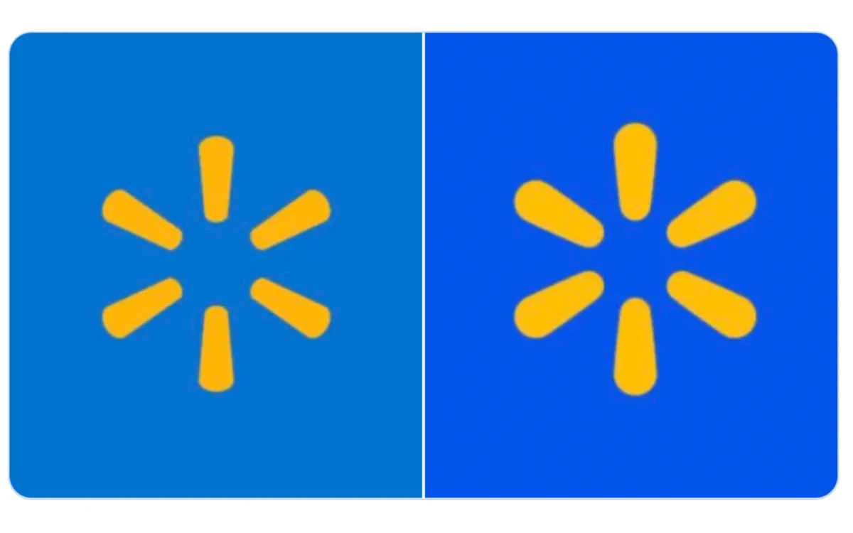
The brand refresh also introduces a notable shift in Walmart's signature blue color, marking a significant change in the company's visual identity. According to the brand guidelines, the retailer has intensified its True Blue shade, creating a deeper, more saturated tone that aims to enhance digital visibility while maintaining brand recognition.
Walmart just dropped their new logo.
— Jon Elder | Amazon Growth | Private Label (@BlackLabelAdvsr) January 14, 2025
Before: After: pic.twitter.com/9d6mfI7LAd
The updated color system establishes a clear hierarchy with True Blue as the dominant brand color, complemented by additional blue variations. The palette introduces Bentonville Blue specifically for typography, while Everyday Blue and Sky Blue serve supporting roles in presentations, graphs, infographics, and charts. This structured approach to blue tones creates what the company calls a "waterfall" treatment, organizing the secondary palette of blues alongside white to establish visual hierarchy in information displays.
Digital accessibility played a crucial role in the color refinement. The deeper True Blue needed to meet Web Content Accessibility Guidelines (WCAG) 2.0 standards, particularly concerning contrast ratios. However, the guidelines specifically note that True Blue text is not AAA compliant at small sizes and should be avoided in such applications, demonstrating the technical considerations behind the color selection.
The brand documentation outlines specific color pairings, with True Blue primarily serving as a background color rather than for typography. When used with photography, the guidelines indicate that white typography and logos are preferred, with True Blue wordmark and yellow Spark reserved for instances where lighter backgrounds require stronger contrast.
The strengthened True Blue also affects the digital manifestation of the brand, particularly in the company's app icon, where it serves as the background for the Spark Yellow symbol. This application demonstrates how the deeper blue tone provides enhanced contrast in digital environments while maintaining the brand's iconic color association.
Color specifications for physical applications, such as signage and print materials, have also been adjusted to account for the deeper blue, with detailed guidelines ensuring consistency across various media and lighting conditions. This comprehensive approach to color management reflects the company's attention to maintaining brand integrity across both digital and physical touchpoints.

