Android 16 brings desktop windowing to Pixel and Samsung phones
Android 16 QPR3 delivers connected display support for Pixel 8, 9, 10 and Samsung Galaxy devices, enabling freeform desktop windowing with new Jetpack libraries.

Android 16 QPR3 delivers connected display support for Pixel 8, 9, 10 and Samsung Galaxy devices, enabling freeform desktop windowing with new Jetpack libraries.
Google this month announced that connected display support for Android has reached general availability with the Android 16 QPR3 release, marking a significant step in enabling smartphone-to-desktop workflows for developers and users on supported Pixel and Samsung devices.
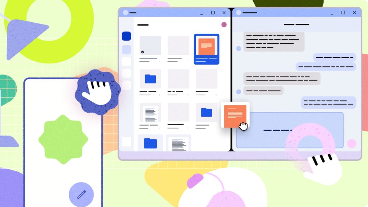
The announcement, posted on March 3, 2026, by Francesco Romano, Senior Developer Relations Engineer on Android, confirmed that users can now connect supported Pixel and Samsung phones to external monitors to access a full desktop windowing environment. Apps run in freeform or maximized windows, and users can multitask across multiple applications simultaneously - a workflow pattern previously limited to dedicated desktop operating systems.
When a supported Android phone or foldable is connected to an external display, a new desktop session starts on that connected display. The phone itself maintains its own independent state. A taskbar on the connected display shows active apps and lets users pin apps for quick access. Multiple apps can run side by side in freely resizable windows.
The behavior differs when a tablet is involved. According to the announcement, when a device that supports desktop windowing - such as the Samsung Galaxy Tab S11 - connects to an external display, the desktop session extends across both screens rather than starting a fresh session. The two displays then function as one continuous system, allowing app windows, content, and the cursor to move freely between them.
At the time of publication, connected displays are supported on the Pixel 8, 9, and 10 series, as well as a range of Samsung devices including the Galaxy S26, Fold7, Flip7, and Tab S11.
Google and Samsung have collaborated to bring this desktop windowing experience to devices across the Android ecosystem running Android 16 while connected to an external display. The partnership reflects ongoing co-development between the two companies on Android platform features - a relationship that has drawn scrutiny in other contexts. Samsung's One UI 7 update in April 2025 had already demonstrated how closely the two companies' software decisions can intersect, when a Samsung system update quietly replaced Google Discover with Samsung News on swipe panels.
The connected display feature was first shown at Google I/O 2025 and has since moved through development to reach general availability in the QPR3 release. QPR stands for Quarterly Platform Release - a mid-cycle update track Google uses to deliver new features and fixes between major Android versions.
According to Romano's post, the Android 16 QPR3 release finalized three areas of the connected display experience: windowing behaviors, taskbar interactions, and input compatibility covering mouse and keyboard. The release also included compatibility treatments to scale windows and avoid app restarts when switching displays - a practical concern for developers whose apps may not handle display configuration changes gracefully.
Three technical areas require developer attention. First, apps should not assume a constant Display object, since that object can change when a window moves to a different display or when display configuration shifts. Apps need to handle configuration change events and query display metrics dynamically rather than caching them. Second, external displays can have vastly different pixel densities than a phone's primary screen, requiring careful use of density-independent pixels (dp) and density-specific resources. Third, connected display setups typically involve external keyboards, mice, trackpads, webcams, microphones, and speakers - peripherals that apps designed for touchscreen use may not handle well.
The biggest update in Jetpack WindowManager 1.5.0 is the addition of two new width window size classes: Large and Extra-large.
Window size classes are the official set of viewport breakpoints that help developers design and build adaptive layouts. With version 1.5.0, the guidance extends to screens that go beyond the size of typical tablets. The new width breakpoints are: Large, for widths between 1200dp and 1600dp, and Extra-large, for widths at or above 1600dp.
The practical implication is illustrated by Romano using an email client example. A two-pane layout showing a mailbox and a message works well in the existing Expanded window size class. But on an Extra-large desktop monitor, the same client could display three or four panes simultaneously - for example, a mailbox, a message list, the full message content, and a calendar panel - all at once. Simply scaling up a tablet layout to fill a larger screen is rarely the right approach.
To use the new breakpoints, developers switch their call from WindowSizeClass.BREAKPOINTS_V1 to WindowSizeClass.BREAKPOINTS_V2. The Compose Material 3 Adaptive library has been updated from version 1.2 onward to support the new breakpoints, and developers opt in by declaring the updated breakpoints in their Gradle build file.
Navigation 3 is the latest addition to the Jetpack collection, and it reached its first stable release alongside this announcement. It is a navigation library built for Compose and designed to work with adaptive layouts. The system for managing UI flow is based on what the library calls Scenes.
A Scene is a layout that displays one or more destinations at the same time. A SceneStrategy determines whether a given Scene can be created. Chaining multiple SceneStrategy instances together allows developers to display different scenes depending on screen size and device configuration. For example, a ThreePaneSceneStrategy could display three panes side by side when the window is at least 1200dp wide, fall back to a TwoPaneStrategy when there is less space, and default to a single-pane view when neither strategy can be satisfied.
For out-of-the-box canonical layouts - such as list-detail and supporting pane - developers can use pre-built Scenes from the Compose Material 3 Adaptive library, available from version 1.3 and above.
A separate post published on March 16, 2026, by Ivy Knight, Senior Design Advocate at Android, announced major updates to Android's design resources. These include new Desktop Experience guidance and a refreshed Android Design Gallery.
Knight defines a desktop experience as any situation where an app is in a desktop-like mode - typically involving a non-touch input device like a keyboard or mouse, or another display such as a monitor. The guidance covers six design principles specific to this context.
First, adapting an app to the desktop experience should not be an afterthought. When designing a mobile app's layout and information hierarchy, the structure should be flexible and modular from the start. Second, the increased screen space should be used meaningfully - showing more information in a denser layout rather than simply scaling up elements to fill the space. Third, motion transitions behave differently on desktop: small UI elements moving short distances can be faster than on mobile, since users' fingers do not obstruct the screen, while large UI elements moving long distances often need to be slower or simplified to avoid visual overwhelm.
Fourth, users expect to perform different types of tasks simultaneously in a desktop environment, and apps should support multitasking within themselves, not just rely on the OS's multi-window capabilities. Fifth, while mobile design focuses on simplicity and streamlined task flows, desktop users expect to accomplish more in fewer steps - the right balance between efficiency and not overwhelming users with information is critical. Sixth, touch, pointer, and physical keyboard are all equally important in a desktop environment, because users switch between them frequently.
The design documentation also covers multitasking specifics. Desktop users often keep multiple windows of the same app open. Android allows users to switch between instances using the keyboard shortcut Alt + Tab. Drag-and-drop interactions are explicitly called out as a mechanism for moving data between apps and the OS in a multi-window environment. For media playback, apps should continue playback when minimized or moved to the background, and picture-in-picture (PiP) mode - allowing video to play in a floating window while navigating elsewhere - is highlighted as a further enhancement.
Knight's March 16 post also introduced the Android Design Gallery, described as a living catalog of inspirational examples across multiple verticals, form factors, and UX patterns. The gallery covers categories including creativity, games, media, productivity, reading, shopping, and social, with filtering by form factor, UX pattern, input type, and screen size class (compact, medium, expanded).
The gallery includes example designs for workflows such as multi-tasking while reading, social media editing, drag-and-drop interactions, product detail views, and file browsing. It covers input types including touch, mouse, keyboard, stylus, and game controller, and spans form factors from mobile to desktop.
The Android developer documentation on adaptive layouts - last updated on February 2, 2026 - emphasizes that adaptive design should be the default starting point, not a feature added later. According to that documentation, the Android mobile market includes handset phones, foldables, tablets, and everything in between. Certain features may not make sense on every screen size or form factor, but adaptive design gives users more freedom regarding ergonomics, usability, and app quality.
The documentation provides specific do-and-don't guidance. Apps should set a maximum width on content and components to prevent stretching to full width. Thinking in terms of containment or panes - using intrinsic and visual containers to group elements - makes designing across all device types easier. Content can be constrained, expanded, or reflowed depending on the available space.
A high-quality app, according to the documentation, should meet the differentiated tier in core app and large screen quality guidelines.
The connected display announcement has implications for mobile advertising and app measurement that extend beyond developer tooling. As Android apps run in desktop windowing environments, the distinction between mobile and desktop ad inventory becomes more complex. An app running in a freeform window on an external monitor attached to a phone occupies a different context than the same app on a phone screen - yet it originates from the same device.
Google's Gemini integration across Android has been a running theme in the Android ecosystem, with the assistant transition from Google Assistant still playing out as of late 2025. Connected display support adds another layer to how Android devices function as computing platforms, not just mobile endpoints.
For advertisers, the expansion of Android into desktop-like environments raises questions about targeting parameters, viewability measurement, and creative formats. Ads designed for portrait mobile screens may render differently - or inappropriately - in resizable freeform windows on large monitors. App developers who monetize through in-app advertising will need to consider how their ad implementations respond to density changes, window resizing, and display configuration changes - the same technical areas flagged by the platform documentation.
The requirement that apps handle Display object changes dynamically is directly relevant to ad SDKs that cache display metrics to determine ad unit dimensions or select creative formats. If those SDKs do not handle configuration change events, connected display sessions could produce incorrect creative sizes or broken layouts. Ad measurement platforms tracking viewability will similarly need to account for window-based rendering on external displays, where a window may be partially off-screen or resized by the user at any point during an ad impression.
Related PPC Land coverage
Who: Google and Samsung, with developer relations engineers Francesco Romano and design advocate Ivy Knight as the named authors of the two announcements. The changes affect Android app developers, device manufacturers, and users of supported Pixel and Samsung devices.
What: Connected display support for Android reached general availability with the Android 16 QPR3 release. The feature allows users to connect supported phones to external monitors and access a desktop windowing environment with freeform, resizable windows. Alongside this, Jetpack WindowManager 1.5.0 introduced two new window size classes (Large: 1200-1600dp; Extra-large: ≥1600dp), Navigation 3 reached its first stable release, and Google published new Desktop Experience design documentation and an Android Design Gallery.
When: The connected display general availability was announced on March 3, 2026. The Desktop Experience design guidance and Android Design Gallery were announced on March 16, 2026. The feature was first previewed at Google I/O 2025.
Where: The feature is available on supported hardware - Pixel 8, 9, and 10 series phones, and Samsung devices including the Galaxy S26, Fold7, Flip7, and Tab S11 - running Android 16 and connected to external displays. Developer tools are available via Jetpack libraries in the Android developer ecosystem.
Why: Google is extending Android beyond the phone form factor, making it function as a full desktop computing platform when connected to an external display. The move positions Android-based devices as alternatives to traditional desktop computing in productivity and multitasking scenarios, while requiring developers to update their apps to handle new windowing behaviors, display configurations, and input types.