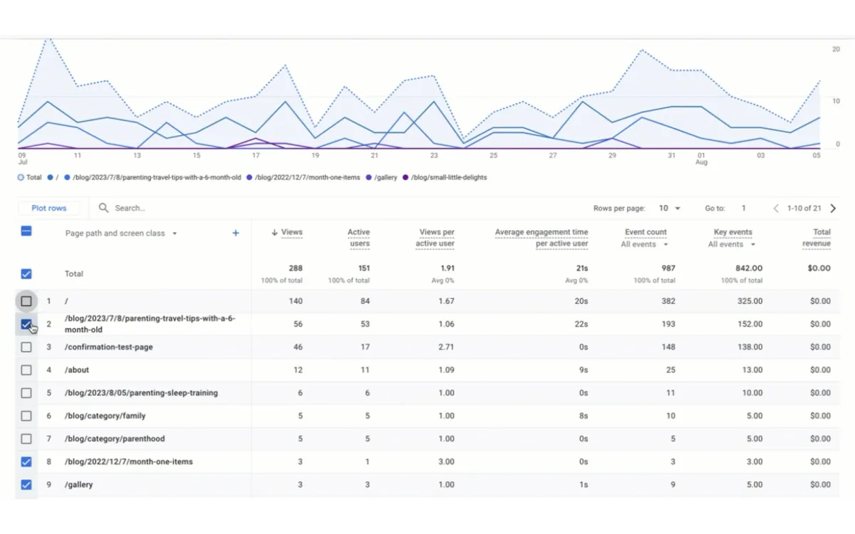
Kyle Rushton McGregor, an Analytics Consultant specializing in Google Analytics 4, Looker Studio, and Google Tag Manager, today spotted the rollout of a new feature in Google Analytics 4 (GA4). According to McGregor, users can now plot rows in line charts within detailed reports, marking a significant enhancement to GA4's data visualization capabilities.
This update, observed in multiple GA4 accounts, represents a reintroduction of functionality previously available in Universal Analytics, Google's predecessor to GA4. The feature allows for more granular and customizable data presentation, potentially improving the depth and clarity of insights derived from GA4 reports.
Understanding Row Plotting in GA4 Line Charts
Row plotting in line charts refers to the ability to visualize individual data points or rows as separate lines on a chart. This feature offers several advantages:
- Detailed Trend Analysis: Users can now track multiple metrics or dimensions simultaneously over time, allowing for more nuanced trend identification.
- Enhanced Comparative Visualization: By plotting multiple rows, analysts can easily compare performance across different segments, categories, or metrics within a single chart.
- Improved Data Granularity: This feature enables the visualization of more specific data points, providing a deeper level of detail in reports.
- Customizable Data Representation: Analysts can select which rows to plot, tailoring the chart to focus on the most relevant data for their analysis.
While the exact technical details of the implementation have not been disclosed, the feature appears to be a server-side update rolled out by Google. This means users do not need to take any action to access the new functionality.
According to McGregor's observations, the feature is gradually appearing in GA4 accounts, suggesting a phased rollout strategy. This approach is common for major platforms like Google Analytics, allowing for controlled deployment and monitoring of potential issues.
To access this new feature, users should navigate to the detailed reports section within their GA4 interface. The option to plot rows should be visible when interacting with line charts in these reports.
The introduction of row plotting in line charts has several implications for GA4 users:
- Enhanced Data Exploration: Analysts can now visualize multiple data points simultaneously, uncovering insights that may have been obscured in more generalized charts.
- Improved Report Customization: The ability to select specific rows for plotting allows for more tailored reporting, potentially improving communication of insights to stakeholders.
- Streamlined Comparative Analysis: By plotting multiple rows on a single chart, analysts can more easily identify patterns, correlations, and discrepancies across different data points.
- Better Alignment with Universal Analytics: For organizations still transitioning from Universal Analytics, this feature helps bridge the gap in functionality between the two platforms.
The reintroduction of row plotting in line charts has been positively received by the analytics community. McGregor's announcement on LinkedIn garnered attention from other professionals in the field, indicating a high level of interest in this feature.
This update aligns with Google's ongoing efforts to enhance GA4's capabilities and address user feedback. As GA4 continues to evolve, users can expect further refinements and new features aimed at improving data analysis and reporting capabilities.
While this update marks a significant improvement in GA4's functionality, it's important to note that the platform is still evolving. Users and industry professionals will be watching closely to see how Google continues to develop and refine GA4 in response to user needs and changing data analytics landscapes.
Broader context of GA4 development
The introduction of row plotting in line charts is part of a larger trend in GA4's development. Since its launch, Google has been steadily expanding GA4's capabilities, often in response to user feedback and comparisons with Universal Analytics.
Some key areas of focus in GA4's development have included:
- Enhanced Data Model: GA4's event-based data model offers more flexibility in tracking user interactions across different platforms and devices.
- Advanced Machine Learning: GA4 incorporates machine learning capabilities to provide predictive metrics and insights.
- Privacy-Centric Design: With increasing focus on data privacy, GA4 has been designed to operate effectively in a cookieless future.
- Cross-Platform Analytics: GA4 provides a unified way to analyze data from websites and apps together.
The reintroduction of familiar features from Universal Analytics, such as row plotting in line charts, suggests that Google is attentive to user needs and is working to ensure GA4 meets or exceeds the capabilities of its predecessor.
Key Points
- Google Analytics 4 has introduced row plotting in line charts within detailed reports.
- The feature allows users to visualize multiple data points or rows as separate lines on a chart, enhancing data analysis capabilities.
- This functionality was previously available in Universal Analytics and has been reintroduced in GA4.
- The update is being gradually rolled out across GA4 accounts.
- Row plotting in line charts offers benefits such as detailed trend analysis, enhanced comparative visualization, improved data granularity, and customizable data representation.
- This update is part of Google's ongoing efforts to enhance GA4's capabilities and address user feedback.
- The feature aligns with broader trends in GA4's development, including an enhanced data model, advanced machine learning, privacy-centric design, and cross-platform analytics.

